BLAH BLAH BLAH, Bloggers Love Ashland, Holmes!
Sunday, December 4, 2011
Book Project
Wow, last project of the class already; hard to believe! My book for the project was made with my nephews in mind: as always, head to the DMF1 projects tab to view. Time sure does fly.
Sunday, November 13, 2011
Saturday, November 5, 2011
Sunday, October 30, 2011
Sunday, October 23, 2011
2nd and 3rd Erasures
As with all of my DMF1 projects, go to the "BLAHjects" tab on the home page to view them along with the descriptions/response.
2nd
Original

Erased
Original

Erased

Wednesday, October 19, 2011

Sunday, October 16, 2011
Reflection on Scratch Composition Assignment
Working with flat color was fun and challenging—in the best
of ways. The absence of continuous color directs the viewer’s focus to the
simple outline of an object, and working within the “confines” of that
simplicity is wonderful. Simply wonderful. I like the idea of taking a step
back and focusing on simple shapes and colors to convey a message. With the
recent increase in the accessibility of cameras that shoot in HD and deliver
photos bursting with colors and detail, we have found ourselves bombarded with
loud and complex photography; thus this assignment was refreshing for me.
All of my Scratch compositions were created with the
intention of illustrating a scene that correlates to a memory of mine from or
an idea of Ashland. In “The Guardian” I wanted to convey a large and colorful,
yet slightly obscure being that sat up in the hills and watched over the town.
Eventually I settled on a large bird that sat on Mt. Ashland and watched over
the migrating birds. Working with simple shapes such as ovals and triangles, it
was simple and effective to portray such a bird.
I employed simple shapes again in “Snow Angels” to set the
scene with a snowy wonderland filled with sparse and simple trees. The stars in
the night sky were made using only two triangles of varying scale. The “angels”
were the most involved of anything in that composition—the wings took numerous
vectors to create the look I was going for.
The final composition, of a full moon, is again set in
Ashland but features a central and prominent full moon of pure white set
against the black silhouettes of simple trees and mountains. I made this
composition and later used it as a poster to advertise a full-moon bicycle ride
around Ashland the same night. While this intention influenced my process, the
simple colors and shapes allowed me to create an impactful and effective “poster”
that garnered a decent amount of positive feedback.
I choose the colors that I used first to accurately represent
the real-world thing that they were coloring, and second to (hopefully) work
well with the surrounding color. Both of the first compositions were more
realistic than stylized, though I put more thought into trying to use the same “family”
of color in the third. Oranges and whites were used a plenty, with black being
featured quite well, too. I thought that the small white bike wheels paralleled
the large white moon well.
Wednesday, October 12, 2011
Final SCRATCH Composition for DMF1

So the full moon is tonight. That inspired me to design a composition to use as a poster for a full moon bike ride (see post at http://sobikeblog.com/2011/10/12/oh-hay-full-moon-ride-tonights/)
Reflection on scratch comps coming later this week . . .
Saturday, October 8, 2011


Friday, October 7, 2011


SOU Bike Program Work Party
Hey SOU Students! Interested in bicycles? Interested in getting involved with other people who like bicycles? Like getting your hands dirty and greasy and gettin' stuff done??
Come help out with the SOU Bike Program bike shed clean up TOMORROW (Saturday) from 11-2.
See map for how to get there.
There will be coffee and snacks!
For more info, email SOUbikes@gmail.com

Come help out with the SOU Bike Program bike shed clean up TOMORROW (Saturday) from 11-2.
See map for how to get there.
There will be coffee and snacks!
For more info, email SOUbikes@gmail.com

Wednesday, October 5, 2011
Type Compositions Reflection
I had never used Photoshop before taking this course. The
difference in scale between what I knew two weeks ago and what I know now
compares rather well to my fifth type composition. That being said, I find it
intuitive (at least on a Mac, can’t speak for the PC version) and incredibly
fun. In design I have always loved it when there are enormous differences in
scale and many of my composition represent that love. Everyone loves tiny
things; I think we all yearn to be small again in someway.
Speaking of intuitive, working with layers wound up being
just that. As I was working on these compositions, I realized that I delineate parts
of my life into layers, too, though never exactly realized it. Working on bicycles
can be similar to using Photoshop in that you can break the bicycle and its
respective repairs down into tasks or layers. The background layer is cleaning
all the dirt, dust, mud, road grime, etc. off to get it to a “working” base, of
sorts. After that comes many other tasks, many of which need to be “applied” in
a certain order because they interact with and affect the other tasks. Of
course it is much easier to go back and change a layer in Photoshop than on a
bicycle, but the general idea is the same. Naming the layers certainly helped,
as did turning the visibility off and on when needed.
In most of my compositions, the letters wound up being the
figures more than the ground, although in some they were both. I liked the idea
of breathing life into an object that usually does not see any. The A’s in
number four are supposed to be salmon swimming up stream, and the little A’s
climbing the big one are obvious mobile and alive. I’ve always thought that
little things have a tendency to look very much alive when juxtaposed with
much, much larger things, as shown in number five and number two. Life is
wherever we choose to find it and finding it in letters was exciting and fun.
(all of my projects and essays for DMF1 are also found under "BLAHjects for DMF1 under the header image!)


Design Time Commences . . .
. . . now.
Photoshop is fun.
I have four more compositions to make using only one letter from just one font type.
To A or not to A . . .
hmm.
Photoshop is fun.
I have four more compositions to make using only one letter from just one font type.
To A or not to A . . .
hmm.
Monday, October 3, 2011
Ashland Is Nice
When you are in the middle of something it is very tough to take a step back and gain perspective. This happens with Ashland, especially when you grow up here. Let's see . . .
It's a beautiful town; quaint, friendly, nice. Many people describe it so, yet when you have spent your whole life here that doesn't matter too much. Before I moved away from Ashland I already knew that it was all of that and more, yet I didn't experience it so much anymore.
Moving away and then coming back reinforced it for me, though. Ashland really is friendly. It really is nice. Quaint . . . well, a lot of things are quaint and that's perfectly fine, but regardless of quaintness, Ashland has a lot going for it.
People smile. That says a lot!
:-)
Saturday, October 1, 2011


Friday, September 30, 2011
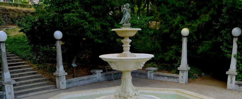
Lithia Park Photos
(click for full picture)
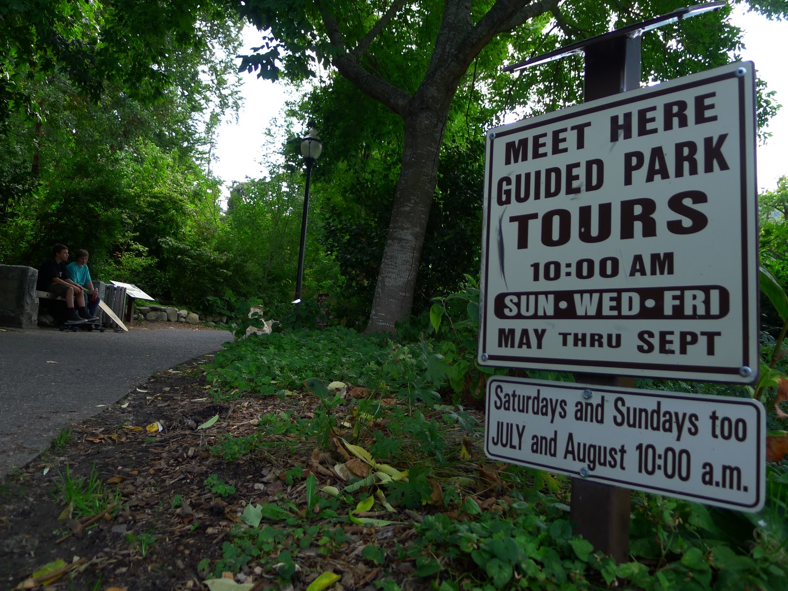
Ahh Lithia Park. You offer guided tours!

Looks like Fall is on its way . . .
More about BLAH
So.
I already have a blog that I've been doing for awhile now.
I also just started another.
So why this one?
Well, Life(Cycles) is a blog that focuses on bicycles and life (and everything in-between, which can be a lot). SO Bike Blog focuses on the local bicycle culture and family of Southern Oregon (hence the SO)
This blog focuses on Ashland.
Having grown up here, and having experienced almost 20 influential years of life in this town, I have got quite an affinity for the place. Ashland is a rather unique and beautiful spot in the world and many people realize it. The people are usually quite friendly, the lifestyle is slow(er than big cities) in the best of ways, and the surrounding landscape is captivating. There is theatre, outdoor recreation, art, music, food, coffee, a monumentally amazing park, and more.
I want to share Ashland as I have experienced it and as I see it. With BLAH I hope to do that. BLAH also gives my projects for Digital Media Foundations a direction. With the hope of reflecting an aspect of Ashland with each project, I'll have something to work toward that will give meaning and an end goal to my work.
Also Ashland rawks.
Blah, blah, blah.
Wednesday, September 28, 2011
First Type Comp.

First composition on PS using only one letter and font type.
This one was an experiment in multiple layers and features.
PS is waaaay too much fun!
First blog post! BLAH
I live in Ashland and attend Southern Oregon University.
One of my courses is Emerging Media (and) Digital Arts, or EMDA.
I get to make a blog for that course.
This is that blog.
I have another blog that I do, which sometimes takes too much time, should I have the time to give.
When I sat down to think of what a new blog should or would or could be, my mind went "BLAH".
And so here it is. BLAH.
Bloggers Love Ashland, Holmes.
More on the what and the why later.
I'm going to be dumping EMDA related work on here in t-minus . . .
Subscribe to:
Posts (Atom)