
Projects for class.
BOOK PROJECT.


BOOK PROJECT.
What a project to end
the class with! I decided early on to design a book that could someday be given
to my nephews, currently of five and seven years old. Working with a set of
photographs that I took last summer, I created a set of anecdotal bits of
advice to my two little fellows and paired them with the individual statements
with the pictures. When grappling with the tough decision between using color
or black and white, I found myself leaning towards the simplicity of two colors
and went down that road. From this one decision came the next: simplicity would
be the overall theme of my book. Simplicity has been a principle that I have
worked with quite often this term and, while it could wind up being a crutch
that I lean on too often, I found it fitting with this book. The black and
white theme carried nicely throughout the entire work and from it came another:
contrast. Black and white naturally contrast each other and, upon thinking
about this, I decided to carry the theme on to the lay out. Photographs would
contrast simple text on separate pages. The simplicity of the design and layout
let the photographs and words speak for themselves without too much
distraction.
The skill that I found myself relying on the most for this
project was the broad skill of being able to use Photoshop CS5 to suit my
needs. Before this course I had absolutely no
experience with the program and the fact that I have come as far as I have
is pretty neat in and of itself. All of the individual projects have been
incredibly stimulating and fun, but more than anything it has been beneficial
to learn the basic ins and outs of CS5 in
a structured setting.
As earlier stated, this book was designed with my two
nephews in mind; thus I intend to one day hand it to them. Although the words
included in the book may seem simplistic on an academic level, I want to wait
to pass those words on until the boys are at an age where they feel inclined to
contemplate the message behind each message. This could be next year and it
could be a decade down the road. No matter, whenever they are ready, the book
will appear!


POSTER PROJECT
Simplicity: not only is it a beautiful word, but it also
seems to be the main underlying theme of my work for this course; however, this
is due only in part to my affection for the concept. While simplicity is one of
the pillars of design and is one that many designers strive for, I can only
guess that the simplicity of my work is also due in part to the simple fact that simplicity is all I
know at this stage in my experience with Photoshop; when one has but a simple
grasp of a concept or tool, it goes without saying that their resulting work
will also reflect said simplicity. Bright, contrasting, or complimenting colors
can add a lot to a poster, but I feel that my use of colors also falls back on
a general idea of simplicity.
Although simplicity is something that I fall back on because
I don’t quite feel comfortable attempting more complex designs, it also works
quite well in catching a viewer’s eye. In my first poster (the one for an SOU
Bike Program event) I kept the layout simple so that the view focuses on the
text, which is the most important part of that poster. In the rest of my
posters simplicity manifested in bright photos juxtaposed next to simple words;
my goal here was a simple one (pun intended): to let the photograph speak for
itself and to let the simplicity of the text draw attention to itself. I feel
like this was accomplished.
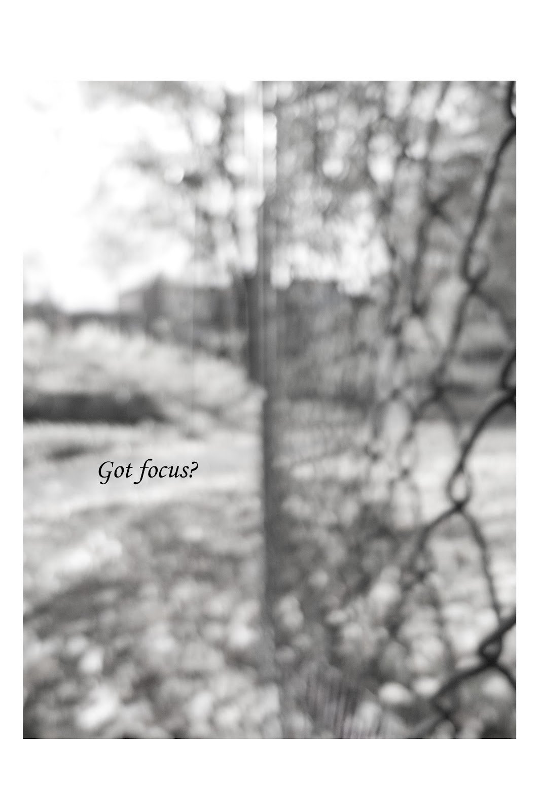
The desired effect on the audience for the SOU Bike Program
poster is rather straightforward, but my goal for the rest is not as obvious: I
wanted to use photos that, by themselves, don’t say much but then come into
focus (again, pun intended) with the accompanying word(s). Predictably (of me),
I went with words that are supposed to be part philosophical and part
inspirational; combining these words with photos that could be considered
abstract was an intentional decision as it makes the audience focus more on the
words and how the photo displays the concept behind the words.


PORTRAITURE PROJECT
Can art change the world? Sure. Can it save the world? Absolutely. To make a gross generalization, too
many people try to quantify “saving” and in doing so take a step away from the
point. To change the world, let alone save
it, it is important not to judge the act of changing (or saving), but
instead to focus on the act itself. Any single thing or act can and will change the world (for better, for worse, or both); therefore,
rather than judge the outcome of said thing or act, think first about how it will bring about change and what sort of change (i.e. positive
versus negative) it will bring and then pour your whole heart into it.
So—again, art does change the world.
Everyday.
A global art project, such as the Inside Out project is exciting in and of itself, so of course
thinking about being involved with
one is also exciting. There are two ways to be involved with such a project:
directly and indirectly. Direct involvement would mean registering with the
project and submitting a photograph for printing; indirect involvement could
mean agreeing with the idea of the
project and utilizing the idea in a personal or individual way. While I chose
not to submit my portraits to the project, I think that the act of sharing them
still fulfills the mission of the project: to share untold stories and images
from around the world. Every person has a story and simply sharing an image of
that person helps to share that story, in a sense.
I decided to multi-task with this project by photographing
the people who work in ECOS, my employer, and then using them for our website.
After our weekly meeting on Friday, I asked anyone interested in being
photographed to join me outside (for lighting purposes) and be photographed.
The lighting was not ideal, but the results were illuminating! I really enjoy
capturing those fleeting moments that are filled with emotion and energy and
although it can be difficult to “replicate” those moments, I found that it was
not so difficult to facilitate an environment where those moments could come
about organically. Speaking with the subjects and trying to make them laugh or
tell me a story brought out their personalities; once the initial shyness had dissipated
and their spirit shone through their eyes, it was only a matter of pressing the
shutter button and cementing the moment in eternity. World changed.


PHOTOMONTAGE PROJECT
(All photographs mine)
After playing around with some photographs that I had
recently shot in class, I decided that it would be necessary for me to snap a
few more with this specific project in mind. I embarked on a mildly successful
photo shoot and wound up with a few shots of the night sky over Ashland that I
was excited about. This shot, combined with a handful from a recent bicycle
ride with my friend David gave me the images that appear here in the final
version.
Interestingly, the hardest part of combining the images was
figuring out what my plan was and where everything would wind up. I found that
once I finalized the layout the actual combining
came rather easily. The tools that we have learned in my lab have proven
effective and easy to use, with ample amounts of practice. I came away from the
last lab feeling more successful with the whole “masking” idea and it came into
play in this project in a successful way. Along with that tool I wound up using
the color range selection tool and the brush tool the most.
My goal with this montage was to display a realistic scene
with an added nighttime sky and a repetition of subjects. I’ve always enjoyed
seeing multiples images of the subject in one frame at the same time; I think
the repetition is fun and playful. I also have always enjoyed long exposure
night shots where the foreground appears bright like day but the sky is dark
and shrouded with starts. Although I have shot such photographs in the past, I
didn’t come away with any that dazzled me this time. Using a mask to combine
the two wound up being better in the long run because it gave me a chance to
play around with masking more. Overall I am quite pleased with how the image
turned out even though it’s a bit rough around the edged. Pun intended.
Final

Originals


ERASURE PROJECT
1st Erasure
Original

Erased

This image is from a wonderful book titled The Golden Age of Handbuilt Bicycles and shows Lyli Herse (wife of famed builder, Rene Herse) competing in the woman's Tour de France. It's a beautiful picture, but I wanted to take the idea of it being a race out, so that the eye would see a woman riding up a gravel road in the countryside. Beautiful as a race, but more beautiful as just a ride. I primarily used the stamp tool to "erase" the car and numbering by taking parts of the road and shoulder and "stamping" them over. To do this, I varied the size of the stamp to take large chunks of surrounding areas to create a more drastic effect or change, and smaller chunks to keep the texture and make it appear more realistic. I would like to think that I maintained a critical perspective, especially in the selection of the photographs that I used. All three of the images chosen were picked because I already knew what I wanted to achieve; once scanned it came down to utilizing the tools at my disposal to try and make my idea a reality. While I found myself getting caught up in the minor details at times, I tried to balance between obsessing over the appearance and quality of the erasure and maintaining my overall goal and reason for erasing in the first place.
2nd Erasure
Original

Erased.
I originally scanned this photograph with the intention of erasing the buildings. After two attempts (which I'll post later I hope, they are on the desktop of the Mac in the computer lab) of doing so, I decided that it was (as of then) beyond my capabilities. Erasing the monk on the road and the words printed over the sky makes the image seem like a landscape photo rather than a National Geo. one. Since I took the car and number out of the first to focus on the human, I decided to take the human out of this one to focus on the scenery.
3rd Erasure
Original

Erased

I chose this image because I knew right away that I wanted to erase the three penguins toward the outside of the photo and focus on the two in the center. While all penguins are (almost by definition) cute, the two that appear to beholding hands are super cute. Erasing the other three focuses the viewer's eye on them and them alone.
SCRATCH PROJECT
Reflection on Scratch Project
Working with flat color was fun and challenging—in the best
of ways. The absence of continuous color directs the viewer’s focus to the
simple outline of an object, and working within the “confines” of that
simplicity is wonderful. Simply wonderful. I like the idea of taking a step
back and focusing on simple shapes and colors to convey a message. With the
recent increase in the accessibility of cameras that shoot in HD and deliver
photos bursting with colors and detail, we have found ourselves bombarded with
loud and complex photography; thus this assignment was refreshing for me.
All of my Scratch compositions were created with the
intention of illustrating a scene that correlates to a memory of mine from or
an idea of Ashland. In “The Guardian” I wanted to convey a large and colorful,
yet slightly obscure being that sat up in the hills and watched over the town.
Eventually I settled on a large bird that sat on Mt. Ashland and watched over
the migrating birds. Working with simple shapes such as ovals and triangles, it
was simple and effective to portray such a bird.
I employed simple shapes again in “Snow Angels” to set the
scene with a snowy wonderland filled with sparse and simple trees. The stars in
the night sky were made using only two triangles of varying scale. The “angels”
were the most involved of anything in that composition—the wings took numerous
vectors to create the look I was going for.
The final composition, of a full moon, is again set in
Ashland but features a central and prominent full moon of pure white set
against the black silhouettes of simple trees and mountains. I made this
composition and later used it as a poster to advertise a full-moon bicycle ride
around Ashland the same night. While this intention influenced my process, the
simple colors and shapes allowed me to create an impactful and effective “poster”
that garnered a decent amount of positive feedback.
I choose the colors that I used first to accurately represent
the real-world thing that they were coloring, and second to (hopefully) work
well with the surrounding color. Both of the first compositions were more
realistic than stylized, though I put more thought into trying to use the same “family”
of color in the third. Oranges and whites were used a plenty, with black being
featured quite well, too. I thought that the small white bike wheels paralleled
the large white moon well.
Images made from "scratch" using vectors (vs. pixels).


TYPE Project
Compositions made using one letter from one font.
I had never used Photoshop before taking this course. The
difference in scale between what I knew two weeks ago and what I know now
compares rather well to my fifth type composition. That being said, I find it
intuitive (at least on a Mac, can’t speak for the PC version) and incredibly
fun. In design I have always loved it when there are enormous differences in
scale and many of my composition represent that love. Everyone loves tiny
things; I think we all yearn to be small again in someway.
Speaking of intuitive, working with layers wound up being
just that. As I was working on these compositions, I realized that I delineate parts
of my life into layers, too, though never exactly realized it. Working on bicycles
can be similar to using Photoshop in that you can break the bicycle and its
respective repairs down into tasks or layers. The background layer is cleaning
all the dirt, dust, mud, road grime, etc. off to get it to a “working” base, of
sorts. After that comes many other tasks, many of which need to be “applied” in
a certain order because they interact with and affect the other tasks. Of
course it is much easier to go back and change a layer in Photoshop than on a
bicycle, but the general idea is the same. Naming the layers certainly helped,
as did turning the visibility off and on when needed.
In most of my compositions, the letters wound up being the
figures more than the ground, although in some they were both. I liked the idea
of breathing life into an object that usually does not see any. The A’s in
number four are supposed to be salmon swimming up stream, and the little A’s
climbing the big one are obvious mobile and alive. I’ve always thought that
little things have a tendency to look very much alive when juxtaposed with
much, much larger things, as shown in number five and number two. Life is
wherever we choose to find it and finding it in letters was exciting and fun.
 |
| First comp. |
 |
| Second |
 |
| Third |
 |
 |
| Fifth |